


GLOBAL RESOURCES (ANIMAL MANAGEMENT/HUSBANDRY)
Contact support@Species360.org
The Global Resources (Animal Management/Husbandry) are found under Start > Global Resources > Animal Management/Husbandry)
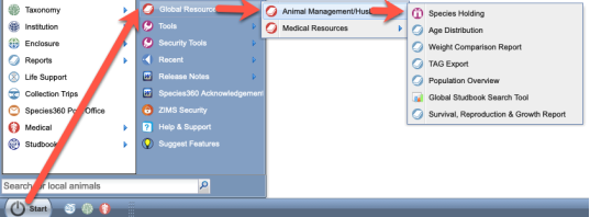
Topics
- Species Holdings
- Age Distribution
- Weight Comparison (replaced by Taxon Profiles)
- TAG Export
- Population Overview
- Global Studbook Search
- Global Member Data
- Taxon Profiles
- Favourite Search Filters
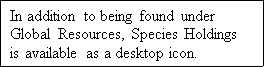
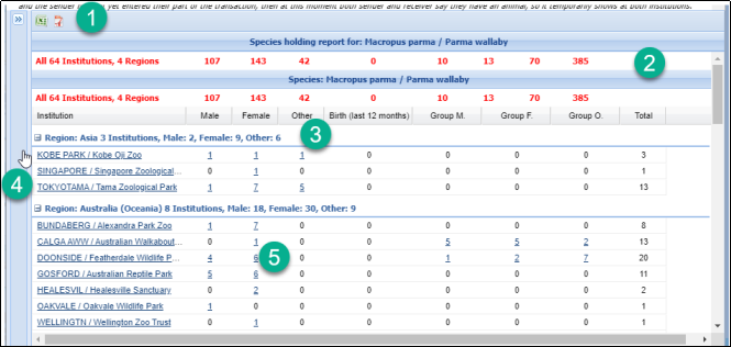
Species Holdings
Species holdings is a global current holding report for a selected taxon.
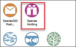
- Enter the desired Taxonomy. If you don’t want to show subtaxa separately uncheck the box.
- Select the scope that you desire.
- Read the disclaimer to help you understand the counts displayed.
- Select to Run Report.
- You can select to run the report from the Taxonomic Tree.
- You can export the report to Excel or pdf.
- The total count of institutions and regions included in the report is at the top.
- The various regions are indicated with the count included.
- The institution is a hyperlink into the institution details.
- The animal counts are hyperlinks to results grids where you can open the global view of the record.
Back to Resources Covered
Age Distribution
The Age Distribution resource (often also called Age Pyramid) is a graphic display of the sexes and ages of the selected species. Age Distributions can often indicate if a species has future reproductive promise as the base (youngest animals) has more members than the top (oldest animals).
For animals to be included in the Age Distribution dataset, they must:
-
Be alive animals.
- Dead animals are NOT included.
- Pre-births (eggs/fetuses) are NOT included.
-
Be an Individual animal.
- Animals held within Group records are NOT included.
-
Be recorded as Physically Held at a ZIMS institution.
- Animals with the status ‘Pending Confirmation’ are NOT included.
- Animals owned by a ZIMS member but held by a non-ZIMS member are NOT included.
-
Have a full birth date.
- Animals with an estimated or Undetermined/Indeterminate birth dates are NOT included.
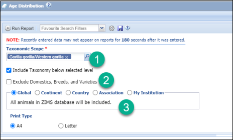
- Enter the Taxonomy desired. By default, Include Taxonomy Below Selected Level is checked.
- You can select to exclude Domestics, Breeds and Varieties.
- Select the scope you desire.
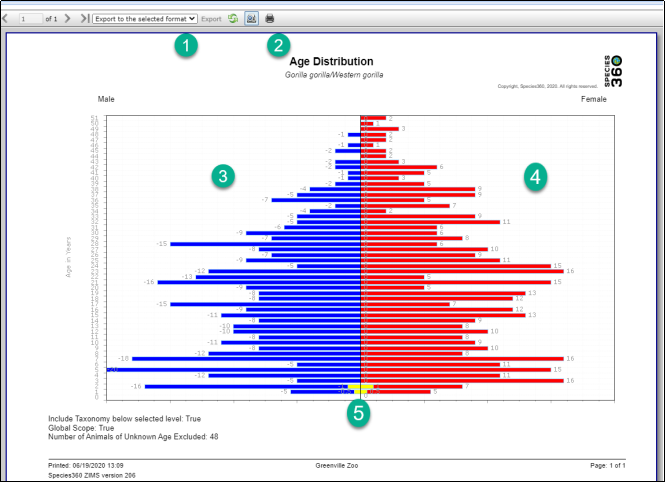
- You can export the graph to various formats.
- You can print the graph by selecting the icon.
- The males display on the left.
- The females display on the right.
5.Undetermined sexes are displayed in yellow and divided evenly between male and female.
Back to Resources Covered
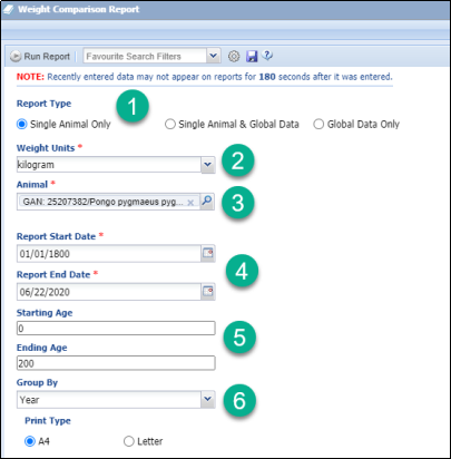
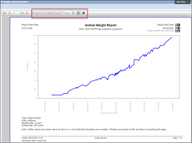
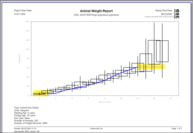
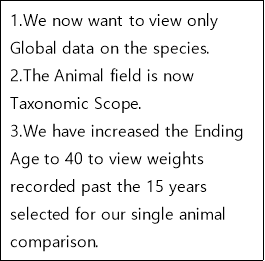
Weight Comparison
The Weight Comparison Report has been replaced by the
Taxon Profiles
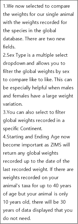
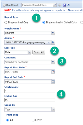
feature allowing you to graph weights of a single animal, single animal and global data or global data only.
To compare weights of multiple local animals you would use the Animal Graphing Tool. See
Tools in Husbandry
.
TAG Export
This resource offers current physical holdings of Species360 member institutions in a downloadable spreadsheet. It is intended to help support strategic collection planning, such as that done by various Association Taxon Advisory Groups (TAGs).
- Before you run the report you should open up the Explanations and Assumptions document to help you interpret the results. It is also available here as a printable document.
- Enter the taxonomy you desire. The taxonomy below is included by default.
- If you wish to exclude domestics, breeds and varieties check this box.
- Selecting to Export Only Taxa Held can save a lot of space as only the species that are held in the selected scope (see below) will display information.
- Select your desired scope. If used by collection planning for a region you would probably select Association.
The report can only be exported to Raw Excel.
The following columns are produced in the Raw Data tab. Since it is in raw Excel these can easily be manipulated and sorted until you get the desired information in the desired format.
- Sort (a numbered order)
- Order
- Family
- Scientific Name
- Common Name
- Obsolete Taxonomy (a "Y" if obsolete)
- IUCN Status
- CITES listing
- Geographical Region (of the Holding Institution)
- Country (of the Holding Institution)
- World Associations (that manage the species)
- Regional Associations (that manage the species)
- Range (wild range)
- Rank (Species or Subspecies)
- Mnemonic (of the holding institution)
- Male
- Female
- Other
- Births
- Group Males
- Group Females
- Group Other
- Total Count
The following columns are produced in the IUCN Summary tab:
- IUCN Status
- Total # of Taxa
- % by Category
- # Taxa Held
- % of Collection Taxa
- # of Animals
- % of Collection Animals
If you want a visual of the holdings, select to View on Map from the navigation bar on the Report Filters screen.
- Select your desired resolution.
- Zoom in or out of the map using the + or -.
- Hover over the bubbles to view the count.
- Use the hamburger icon to print the chart or download the image.
Back to Resources Covered
Population Overview
This resource is intended to be a one-screen per taxon (species or subspecies levels only) overview of the state of the animal population, including key metrics on genetic and demographics, and indicators of the underlying data quality.
- Read the Explanations and Assumptions prior to running the report. It is also available here as a printable document.
- Enter the desired taxonomy at the species or sub-species level.
- If you want the taxonomy below the selected level included check this box.
- Check this box if you want to exclude domestics, breeds and varieties from the report.
- Select the desired scope of the report.
The report can be Run or Exported to Raw Excel for data manipulation.
- The filters selected display at the top.
- The upper left graph plots 6 “basic vital rates” (births, deaths, acquisitions from non-Species360 member sources, dispositions to non-Species360 holders, acquisitions directly from the wild, releases directly to the wild) – each is a count of the events of that kind, by year. For individuals (not necessarily for groups), the net result of these basic rates should explain the observed changes in census at lower left, Note that acquisitions from the wild and releases to the wild may be undercounted, as those transactions may have been entered as to/from wildlife agencies, etc., rather than directly from/to the wild. Species360 current membership is used for the entire time period. Various events in groups may go unrecorded, so group data recorded vital rates may not total to the recorded changes in the census.
- The lower left graph plots two variables – the living population size (individuals plus groups) on Species360 by year (census as of today’s date each year), and the number of institutions physically holding the animals on those dates. Species360’ current membership is used for the entire time period to hold the institutional-scope constant (not all current members may have entered data for 20 years ago, so some positive census trend might be caused by recent years being more comprehensive).
- The upper right graph is a smaller version of the Age Distribution (Pyramid) Report. Occasionally a data entry error generates an apparently very long-lived animal, stretching the vertical axis.
- The lower right quadrant presents calculated metrics on the data available for the population – some measures provide demographic information, some genetic info, and some are indicators of the data quality on Species360 for this taxon. Due to potential missing institutional information (not in Species360) and historical data weaknesses, some of these calculated parameters may represent a lower bound. More Contributing Founders, for example, may be identified if more complete histories and pedigrees are filled in for today’s living animal population. For details read the Explanations and Assumptions document.
The Raw Excel has the following tabs:
- General Species and Filters information
- Acquisitions (Births, Acquisitions from Non-Species360 members, Acquisitions from Species360 members outside population subset and From Wild) and Dispositions (Deaths, Disposition to Non-Species360 members, Dispositions to Species360 members outside population subset, and Release to Wild) by Year
- Total number of animals and total number of holding institution by Year
- Current Age Graph
- Data Quality
- Combined Totals by Year
Back to Resources Covered
Favourite Search Filters
Favourite Search Filters are available for all resources except for Species Holdings. These filters allow you to save time by creating and saving frequently used filters.
Complete your filters as desired, select the Save icon and name the filter. Selecting Save will save the filter, selecting Save & Run will save the filter and run the report.
The filter will be available to select in the Favourite Search Filters box. Once selected the filters for the report will prefill.
Back to Resources Covered
Revised 5 May 2026