


Environmental Quality Graph Tool
The Environmental Quality Graph Tool allows users to export and/or graph environmental measurements recorded in Enclosure, Life Support or Component records.
Note, enclosure names greater than 50 characters will not return results in the graphing tool.
Topics:
|
|
|||
|
|
Graphing : |
||
|
|
|
||
|
|
|
||
|
|
|
||
|
|
|
||
|
|
|
||
|
|
|||
|
|
|
||
|
|
|||
|
|
|
||
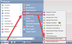
Accessing the Environmental Quality Tool
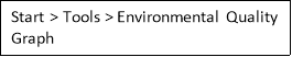
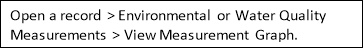 You can access the tool from either the start menu, or through enclosure/life support/component measurements:
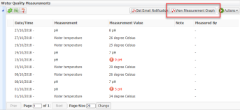
Accessing the Graphing Tool from an record that already has data in ZIMS Measurement Grid will default the “measurement type” filter in the tool to the currently used types of measurements.
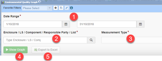
The Search Menu
The search menu is the same, whether you are exporting to Excel or showing a graph.
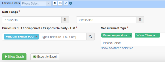
First select the desired date range (1), then choose your entity (2). This can be a combination of one or more enclosures, life supports, components, enclosure lists or responsible parties. Next, choose the measurement type (3), you can again choose multiple items for this box. Finally, you have the option to Show Graph (4) or Export directly to Excel (5).
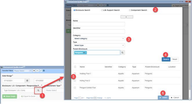
The Search Glass
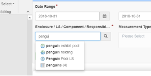
You can use the search glass to find entities to graph. Click on the search glass (1) to bring up the search menu. Choose the type of search to run (2), enter your search criteria (3), then click Search (4). In this example we are searching for all of the enclosures under the parent enclosure ‘Penguins’. Choose which results to select by checking the boxes (5), then click the Select button (6) to add the entities to your box.
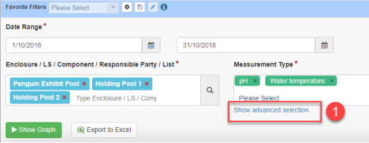
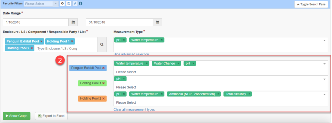
Advanced selection for multiple entities and measurement types
The ‘show advanced selection’ feature (1) allows you to customize the measurement types you want to display for each entity.
Once clicked, you can customize each entity and choose the specific measurements you want to display.
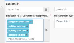
Searching by Enclosure List
Enclosure Lists can be used to select enclosures, and is a time saver. By entering an enclosure list in the Entity field, the number of enclosures in that list displays. On the left we see that the Penguin enclosure list contains 4 enclosures. When the list is selected, the four enclosures populate into the Entity field. You are able to remove any entity if it is not needed or add any additional entities.
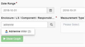
Searching by Responsible Party
By entering a Responsible Party in the Entity field, the number of enclosures the staff/team are responsible for displays. Selecting the name will populate the Entity field with the entities. You are able to remove any entity if it is not needed or add any additional entities.
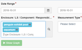
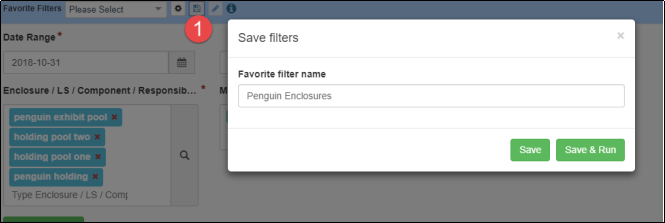
Creating Favorite Filters
Another time saver is the ability to create Favorite Filters by selecting your filters and then selecting the Save icon (1). Here we are saving a filter for all our penguin enclosures. It will now be available in the Favorite Filters list.
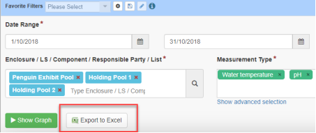
Exporting to Excel
Once you have your filters selected, clicking Export to Excel will export the chosen data set directly to Excel without needing to run the graph. This is especially useful if you have a large data set of multiple entities and measurement types.
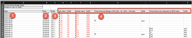
The downloaded data will display differently depending on how many entities and measurement types you have chosen.
The Date (1), Time (2) and Entity (3) will always be your first columns. The measurements you selected, in this case pH, salinity, Total Ammonia and Total chlorine (4) will then display one by one with their unit of measure. Multiple measurements on the same day will appear on the same row.
The Environmental Quality Graph
The Environmental Quality Graph allows you to graph enclosure, life support, and component measurements, both singularly and as a combination. To explain in detail, let’s look at specific examples.
Our scenario here is simple. We have three pools for our penguins – an Exhibit Pool, Holding Pool One and Holding Pool Two. We record pH and water temperature on them weekly.
Graph a single measurement for a single entity
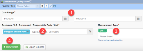
We want to look at the pH for our exhibit pool for October 2018.
Select the desired date range (1), then choose your entity (2). This can be a combination of enclosures, life supports, components, enclosure lists or responsible parties. Next choose the measurement type (3) and click Show Graph (4) to view the results.
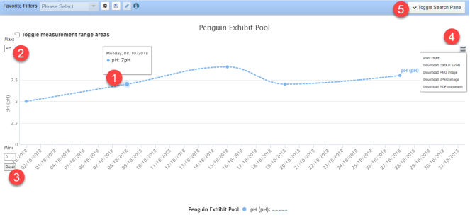
The Environmental Quality Graph will now display any pH values recorded for the Penguin Exhibit Pool between the selected date ranges. Each circle represents a data point.
Hover over any of the data points (1) to display the date and measurement recorded.
If needed, you can change the values on the y axis (2), and reset back to the original values by clicking reset (3).
Selecting the hamburger icon (4) will allow you to print the chart as a JPEG, PNG or PDF, or to export the data in Excel.
Toggle Search pane (5) will bring down the menu to re-select the filters.
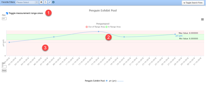
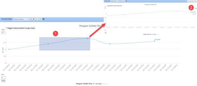
If you have created a Measurement Range Template for the enclosure and the measurement, checking the Toggle Measurement Range Areas box (1) will display the ranges for that entity on the graph. The desired range displays in green (2), and the undesired range in pink (3). This feature is available ONLY for a single enclosure and single measurement.
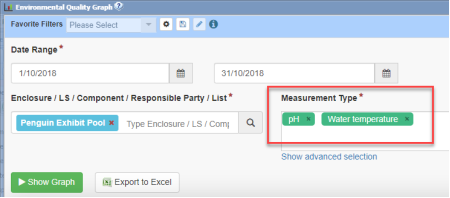
Graph multiple measurements for a single entity
We want to look at both the pH and the water temperature for our exhibit pool for October 2018. The Date Range and Enclosure stay the same, but we select the additional Measurement Type of Water Temperature.
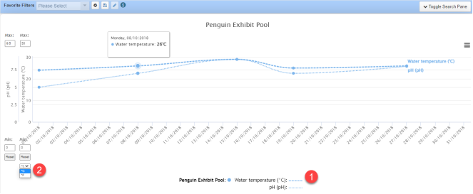
The Environmental Quality Graph now displays both the pH and water temperature on the graph. The water temperature is displayed by the dashed lines, and the pH by the dotted. You can click on either measurement in the key at the bottom to turn it on or off (1). As well as being able to change the y axis min and max, you can also change the unit of measure displayed should you need to (2). Any values not recorded in the chosen unit will be converted. Note that because we are now looking at two measurements, the range parameters cannot be indicated.
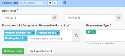
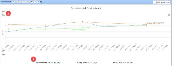
Graph a single measurement for multiple entities
We now want to look at the pH measurements for all three of our penguin pools.
We have added the two holding pools and removed the water temperature from the Measurement Type.
Each entity has its own color (1). Because all three entities are graphing pH, we only have one axis (2), but we are still able to change the min and max values.
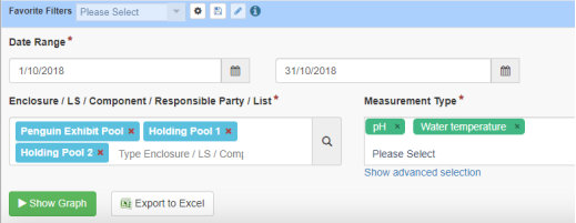
Graph multiple measurements for multiple entities
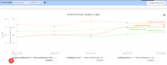
We now want to look at both the pH and the Water Temperature in all our pools.
All three enclosures and pH remain, and we have added water temperature to the measurement type box.
Each enclosure again has its own color (1). The measurements are displayed by different lines on the graph (1). This time we have two measurements, so we have two y axis (2). You can set the min and max values for each axis. 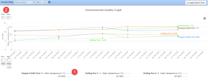
Some Helpful Hints
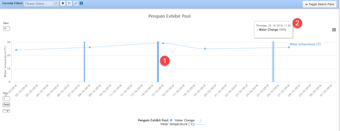
Include Water Changes
We want to compare if Water Temperature is affected by Water Changes in our Penguin exhibit.
Water Changes are displayed in the graph via vertical bars (1). The weight of the bar is dependent on what percentage of water was changed. Hovering over the bar (2) will display the percentage. In this graph the Water Change on 7 October was 50% (a thinner bar), 75% on 14 October (a thick bar) and 50% on 25 October.
Looking at the graph below we see that Water Temperature appears to rise after each Water Change.
Hiding entities or measurements from the graph
By clicking on the entity or specific measurement type in the key, you can show or hide lines from the graph. In the graph below, we have clicked on penguin exhibit pool (1) to removed it from the graph, allowing for easier comparison of the two holding pools.
Zooming into an area
You can click and drag on the graph to select an area to zoom into (1). To go back to the original view, click Reset Zoom (2).
Revised 5 March 2025